2013
length: 6’00” – format: 16:9
(no sound)
made for s[edition]
Text
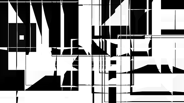
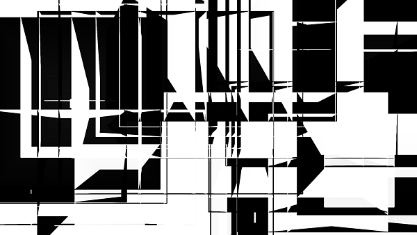
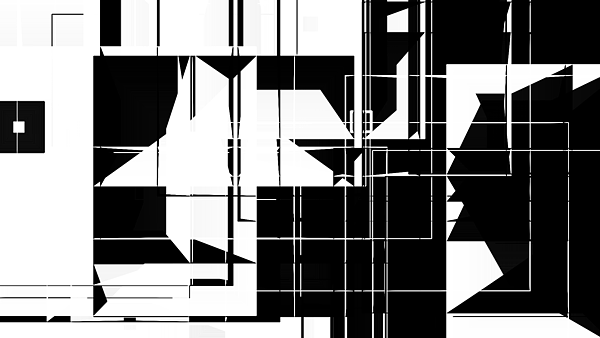
The video B&W Forever! uses the very simple shapes of expanding rectangles to create complex visual monochromatic patterns. Subtle shades of grey are occasonially visible. There seems to be a constant fight for space on the screen between black and white, representing good versus evil, form versus void, light versus darkness… In this very formal artwork by LIA, one can observe these two principles existing in a state of dynamic equilibrium: there is a steady balance between them, but temporarily the situation might change to favor one or the other.


